What are “Landing” and “Thank you” pages? How are they used on websites?
Surprisingly a “Landing” and “Thank you” page are vital to websites and most businesses.
A Landing Page
The definition of a landing page is “a webpage which serves as the entry point for a website or a particular section of a website”. Within Digital Marketing and advertising a ‘landing page’ is commonly referred to as being a standalone webpage. It is distinct from the main website. A landing page is a web page that a visitor can “land” on or arrive at. It has been designed for a single focused objective and commonly follows a ‘Call to Action’. A landing page whilst standalone is still part of a website.
There are 2 categories of landing pages ‘Lead Generation’ and ‘Click Through’. The goal of a ‘Lead Generation’ landing page is to capture a visitor’s data, their name, email address and any information needed to enable direct marketing at a subsequent date. The goal of a ‘Click through’ landing page is to persuade the visitor to click on to another page. This categorised landing page is often used in ecommerce as it can be used to describe an offer or product in detail.
There are several good practices in designing a landing page:
- Remove the global navigation menu and links
- Explain the offer clearly and place visual emphasis on the value
- Write a clear, concise action oriented headline
- Add social sharing icons
- Include a relevant image, animation or short video
The main reason for removing the global navigation menu and links from a landing page is to limit the options available to your visitor, it’s a process in converting a visitor into a lead (customer).
Greg Crystal has written an interesting blog ‘A Detailed Guide to Creating the Best Landing Page Images Ever’ https://blog.hubspot.com/marketing/landing-page-.
An example sequence for a Call to Action, Landing Page and Thank You Page is shown below:
A Thank You page
A ‘Thank you’ page is defined as a web page where subscribers are redirected immediately after they submit their information in your opt-in form. While creating your form, you can specify a webpage on your site to use as your form’s ‘thank you’ page.
A ‘Thank you’ page serves as a method of continuing interaction with a visitor/customer, it has huge potential. In the world of the internet, it’s the polite thing to do. It is also an opportunity to continue interacting with your website visitor/customer. It can be used as an automated research/feedback tool. A well designed thank you page will engage a visitor/customer and it assists in ‘Lead Generation’, with some gentle guidance a website visitor/customer could become a devoted customer. A Thank You page if designed correctly can give a visitor further information on your product/services.
Good practices when designing a thank you page include:
- Confirm the offer or set expectations the visitor/customer has taken advantage of
- Display the navigation menu
- Provide additional content
- Include social media options
- Include testimonials, show a video, display a promotion
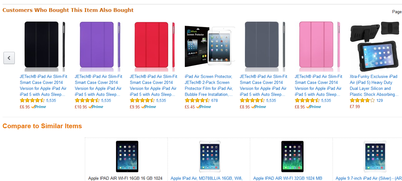
Amazon have implemented brilliant “Thank You” pages, anyone who has purchased from Amazon will of seen the strategic “Customers who brought this item also brought”, “Compare similar items” and “you might also be interested in” pages which follow a purchase.


