Designing Your Website’s Homepage
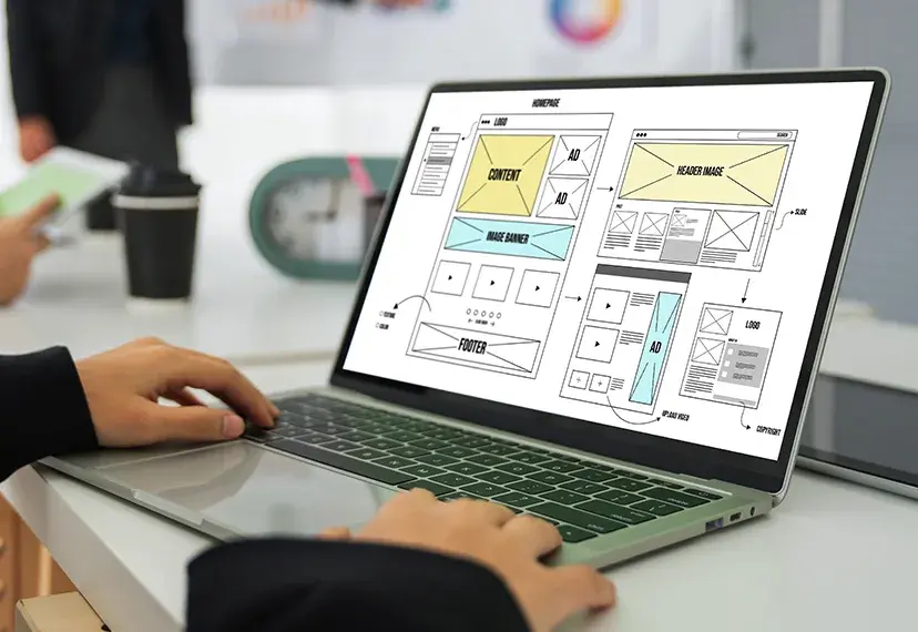
Your homepage is most likely the first page that people will visit, so when designing a home page for a website, it’s important to follow some tried and tested methods in terms of layout. Here are some tips for where certain elements should be placed on the page:
Your contact details should be at the top of the page and clearly visible, usually located top right in the header, if you hide your contact details away then less people will contact you, it’s that simple.
In keeping with your branding, make sure your logo is on display, if you don’t have one then you should consider getting a logo professionally designed. It is likely that it will be with you for a long time.
Ensure you have a menu which is either top or LH side, your menu needs to have clear wording so people understand where they need to go and keep it simple, don’t overcrowd it with too many options.
Banners can create a good visual effect; they can give a business the opportunity to display images and information about their business in an effective way. This can be either static or in slideshow format, but don’t go down the route of using flash. You don’t have to have a banner but it is a very simple way of making your homepage visually engaging.
Make sure you have your most important information at the beginning of your text, so many are about welcoming people to their website and offering up company information. Sorry to damage your ego here but people really don’t care; they just want to be able to quickly make a decision about whether this website provides the information/products/services that they were looking for.
Lastly as an overall tip, make sure that your homepage is consistent with the rest of the website, keep it clean and simple and don’t get so hung up on the design elements that you lose the focus of what you are trying to achieve


