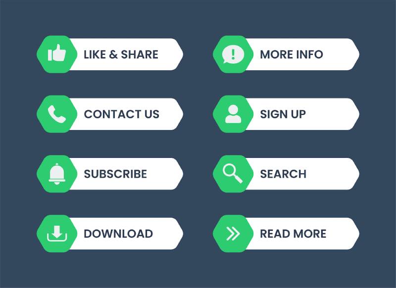
Call to Actions and How to Use Them
CTAs are when you want people to do something. For example, when you want them to sign up for something like an email newsletter or buy a product on your website. You can use CTAs in the form of text, buttons, or images.
The best way to use CTA’s is to keep them simple and clear. Make sure that the text is easy to read and understand, and that the button or image is prominently displayed on your website. You also want to make sure that you don’t overuse CTAs on your website. Too many CTA’s can be overwhelming for visitors and turn them away from your website.
How to Use CTA’s Effectively
Some effective ways to use CTAs on your website include:
– Use actionable language such as “sign up now,” “learn more,” or “download here.”
– Place CTAs in strategic locations on your website where they will be most effective.
– Use contrasting colours for your CTA’s so they stand out from the rest of your website.
– Use images or icons along with your CTAs to make them more eye-catching.
If you’re using CTA’s on your website, make sure you’re doing so in a way that is effective and not overwhelming for visitors. Keep your CTA’s simple and clear and use them in strategic locations on your website. Use actionable language and contrasting colours to make your CTA’s stand out and consider using images or icons along with them. By following these tips, you can ensure that your CTA’s are helping you achieve your website goals.
Using Call to Actions on Social Media Platforms
CTAs aren’t only for your website.
One of the best ways to increase the effectiveness of your social media posts is to use call to actions (CTAs). A CTA is an instruction or request and so you can encourage users to take an action once viewing your post, such as clicking on a link, downloading a file, or subscribing to a service.
CTAs can be used in a number of different ways on social media. For example, you can use them to:
Promote your content – If you have a new blog post, video, or infographic that you want people to see, include a CTA in your post that encourages them to click through and check it out.
Generate leads – If you’re running a contest or giveaway, include a CTA that asks people to enter. If you’re promoting a free download or other lead magnet, include a CTA that encourages people to click and get it.
Increase engagement – If you want more people to comment on your posts, ask them a question or include a CTA that asks for their opinion.
Drive traffic to your website – Every social media post should include a CTA that links back to your website or blog. This is a great way to increase the number of visitors you get from social media and helps you achieve your business goals.
What Words Should I Use for My CTA’s?
Action words are active words of phrases that help people to make the leap and do the thing that you want them to, for example a Call to Action could include words like:
- Find Out More
- Contact Us Today
- Download our Free E-Book
- Secure your Spot Today
- Visit Our Website
Time critical posts are a really good way to create a sense of urgency. If people feel like they might miss out, then they are more likely to take action straight away. Examples of this could include:
- For this Week Only
- Limited Places Available
- First 100 Only
- Only Available Today
These types of words will make the user believe that they need to act now.
Using Images for CTA’s
When it comes to using images for your CTA’s, there are a few things you need to keep in mind. Firstly, your image should be eye-catching and relevant to your offer. It should also be easy to understand at a glance, without needing too much explanation.
Another important factor is size. Your image should be large enough to stand out on the page, but not so large that it takes up too much space or overwhelms the other content. You also need to make sure that the file format is compatible with your website’s design.
Finally, you need to make sure that you have the rights to use the image you choose. Copyright laws can be tricky, so it’s always best to err on the side of caution and use images that you have permission to use.
When it comes to choosing the right image for your CTA, there are no hard and fast rules. However, following these tips should help you create images that are both effective and visually appealing.
Using Colour for Call to Actions
When it comes to choosing colours for your CTA buttons, here are some things for you to consider. Firstly, your colour choice should be relevant to your brand identity and also needs to stand out.
Another important factor is contrast. You want your button to stand out from the rest of the page, so choose a colour that will contrast well with the background. For example, if your website has a light colour scheme, you might want to use a dark coloured button.
Finally, you need to make sure that your colour choice is accessible. That means ensuring that it has enough contrast to be readable by people with different types of colour blindness.
CTAs are your best conversion tool and if you don’t utilise them across your marketing then you are missing out.
If you need help with your CTA’s or Digital Marketing, get in touch today to see if we can help! (And that my friends, is a Call to Action).


