How to Design a Great Website
The internet holds such a wide range of opportunities and yet it can be overwhelming for some, too much choice can send our brains racing with information overload. There are so many ways in which online marketing can benefit a business that it really requires one to work they way through the minefield and make the most of what is a available to them.
Having a website it something that most businesses see as a necessity now, but there are so many poorly designed sites out there. It’s an area that tends to lack investment and proper thought with many companies basing their site on what they want to tell people rather than what people actually want to know.
Some things to avoid when designing a website
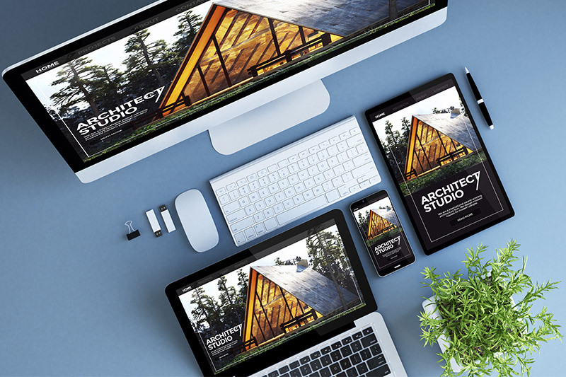
One of the mistakes that amateurs make in the field of website design is cross browser testing. Not everybody uses Internet Explorer and you need to ensure that your website appears correctly in all of the most popular browsers (Firefox, IE, Safari, and Chrome).
Designing a simple site is also important, a cluttered design with too much going on will confuse the visitor and damage their experience. If someone can’t find what they want almost immediately then they will simply look elsewhere.
Keep everything consistent, make sure you use the same font and colours throughout and that the whole site looks unified. By doing so you will help other factors that search engines take into account such as website loading speeds, increased usability which can create a much more popular site will also in turn help your search engine results.
How to engage a visitor
The layout and ease of use is vital, but when designing a website it is important to get the balance right between this and having a great design too. One of the ways you can help to engage visitors when they visit is giving them a more interactive experience, things like video and allowing blog comments will help to keep people on the website in the first place.
So in summary, it’s important to make sure your website looks right and creates the right image for your business, but it also needs to be easy to use in all browsers and encourage visitors to your website to stay there a bit longer and interact with your business. There is of course a lot more to it that discussed here, but if you keep to these simple rules then you can’t go too far wrong when designing a website.


